1
$\begingroup$

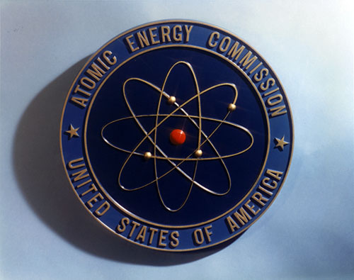
The (former) U.S. Atomic Energy Commission had a seal showing a symbolic view of the atom that is unrealistic but instantly recognizable:

enter image description here

Source: https://blog.nuclearsecrecy.com/2012/04/13/friday-image-the-atomic-energy-commission-seal-1949/

This symbol was part of the visual language of the atomic age, used by towns, Disney, General Electric, and unicode (U+269B) starting in 1948 or earlier.

Taking the depicted image literally, this would represent the atom beryllium (because it shows 4 electrons). The blog author in the source points out that the most important part for nuclear energy (the nucleus) might have been shown with more detail. In fact, the current agency uses the word "nuclear" instead of "atomic".

While we know today that electrons behave very differently, I am wondering why the electrons are shown in orbits that are at an angle to each other. Many cartoons of atomic structure do this (the most common one has three orthogonal orbits), and I am sure many pre-date this particular example.

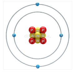
https://www.dreamstime.com/stock-illustration-beryllium-atom-white-background-image51874762#_

If the inspiration for Bohr's model was the solar system, wouldn't you show the orbits all in the same plane, with different radii like in the solar system, like the image above? Was there something known at the time Bohr formulated the model (or before 1949, when the seal was created) that would motivate out-of-plane orbits (maybe angular momentum) while sticking with the inaccurate Bohr model? Or is this a purely artistic choice, helping to make the cartoon more compelling and three-dimensional?

UPDATE: Bohr's drawing do not look like today's textbook drawings of it. Here is a diagram of Xenon (1921-1923).
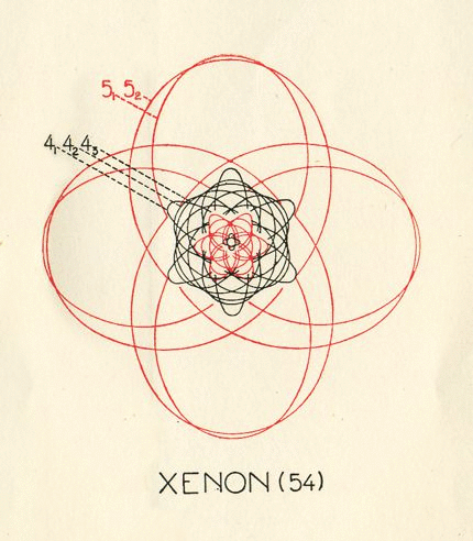
enter image description here Source: https://physicstoday.scitation.org/doi/10.1063/PT.3.1978

The atomic whirl symbol for an atom is often associated with the Rutherford model, even if Rutherford said very little about the position or states of the electrons (perhaps because classical physics did not have a model without contradictions, and a satisfying model required the combination of experimental data with quantum theory). In Rutherford's 1911 book "Radioactive Substances and their Radiations", he states: enter image description here
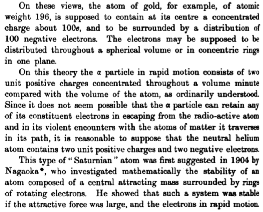
So he leaves open whether electrons are spherically distributed or present in concentric paths in a plane, and acknowledges the earlier hypothesis by Nagaoka of a positively charged center with electrons surrounding it in some way (Saturnian or otherwise). At this time, the neutron had not been discovered, and it was not clear where the high-energy electrons of beta radiation came from (from the nucleus or elsewhere).

$\endgroup$
5
  • $\begingroup$ Comments have been moved to chat; please do not continue the discussion here. Before posting a comment below this one, please review the purposes of comments. Comments that do not request clarification or suggest improvements usually belong as an answer, on Chemistry Meta, or in Chemistry Chat. Comments continuing discussion may be removed. $\endgroup$
    – Karsten
    Commented Mar 17, 2023 at 21:55
  • $\begingroup$ this has bothered me for over a half-century; I wonder if migration to, or a related question posted in HSM SE might be productive? Something like "What was the first..." or Was this ever justified/defended/explained scientifically?" or something along those lines. $\endgroup$
    – uhoh
    Commented Mar 23, 2023 at 2:05
  • 1
    $\begingroup$ @uhoh This post states that the Rutherford model is fuzzy on electronic structure. It does not, however, say when the "atom whirl" was first used. I found sources all the way back to 1948. During WWII, nuclear physics was top secret. Later, there was an effort to make the public comfortable with nuclear power (while also training them how to use fall-out shelters in the cold war). This was probably the time when the Rutherford model (with balls for electrons rather than some fuzzy quantum representation) was popular to popularize nuclear physics. $\endgroup$
    – Karsten
    Commented Mar 23, 2023 at 3:26
  • 1
    $\begingroup$ @uhoh I posted another question here: hsm.stackexchange.com/q/15248/16431 $\endgroup$
    – Karsten
    Commented Mar 24, 2023 at 1:36
  • $\begingroup$ indeed you did, looking forward to its answers! $\endgroup$
    – uhoh
    Commented Mar 24, 2023 at 3:00

1 Answer 1

3
$\begingroup$

Similar to coat of arms and traditional principles of vexillology, a good logo balances the provision of enough detail to be recognizable – regardless if it is mounted to a lectern, or on a business card – while avoiding to much detail of information. This is what Tufte describes as aim for a high data-ink ratio

$$ \frac{ \text{data ink} } { \text{total ink} } = \frac{ \text{elements conveying data information} } {\text{all elements of the chart}}$$

with intentional remove of detail within reason (ref). See, for example, the flags of the states, D.C., and territories of the United States of America:

enter image description here

(image source)

– at this scale of representation, many are perceived with some content in their centre. The ones of Texas, New Mexico, Colorado are among those which stand out.

From perspective of chemistry/physics, the depiction of the beryllium atom is an improvement in comparison of the seal of AEC because the finer structure of the atom nucleus. At the same time the model is wrong for that diameter of atomic nuclei are orders of magnitude smaller than atomic diameter – in case of helium $\pu{1 fm}$ (or $\pu{10^{-15} m}$) of the nucleus, and $\pu{1 Å}$ (or $\pu{10^{-10} m}$) for the atom. Hence, a depiction of atom and atom nucleus in a scale in common often was and remains impractical – see e.g. the logo of the IAEA including an off-centered atom nucleus:

enter image description here

(source)

the Polish Nuclear Research Centre:

enter image description here

(source)

or the logo of The Big Bang Theory

enter image description here

(source)

$\endgroup$
3
  • $\begingroup$ Tufte focused on representation of data, if memory serves me right, not on creation of logotypes. $\endgroup$
    – Buck Thorn
    Commented Mar 17, 2023 at 18:34
  • $\begingroup$ Not to mention that electrons don't have a size comparable to that of a nucleus, as depicted in the logos? $\endgroup$
    – Buck Thorn
    Commented Mar 17, 2023 at 18:36
  • 1
    $\begingroup$ I perceive both the representation of data, as well as logotypes as transmission of information, where intentional white space not used can help in recognition and discern (similar to some fonts of same x-height easier to read at low size/resolution, than others), and hence, related. $\endgroup$
    – Buttonwood
    Commented Mar 17, 2023 at 19:55

Not the answer you're looking for? Browse other questions tagged or ask your own question.