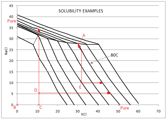
Came across a few graphs that represent the mutual solubility of two compounds in a solvent, for e.g., solubility of $\ce{KCl}$, and $\ce{NaCl}$ in $\ce{H2O}$.
On these particular graphs, I can see $x$-axis as $\pu{g}/\pu{100 mL}$ of $\ce{KCl}$, on $y$-axis as $\pu{g}/\pu{100 mL}$ of $\ce{NaCl}$. And the graph has multiple lines each representing a curve at a specific temperature.
I just wanted to understand how to read these type of graphs:
To me the graphs represent a point wise mechanism. For example, if I pick a spot on the $x$-axis, with $\pu{50 g}$ $\ce{KCl}$ at $\pu{80 ^\circ C}$, does that mean if I dissolve $\pu{50g}$ $\ce{KCl}$ at $\pu{80 ^\circ C}$,then I will not be able to dissolve $\ce{NaCl}$ in it?
Or does it mean if I have a starting condition where I have $\pu{50g}$ $\ce{KCl}$ at $\pu{80 ^\circ C}$, and I start adding $\ce{NaCl}$, then $\ce{KCl}$ will precipitate out at a slow rate till I reach point A at a very rapid rate?
The graph doesn't appear complete, or is at least missing additional info to make sense of it. I want to know what that info is.

